Understand a Pathfinder Subscription
The most important features to understand vessel behavior are within our Pathfinder subscriptions. These subscriptions give you a great overview of a vessel’s pattern of life.
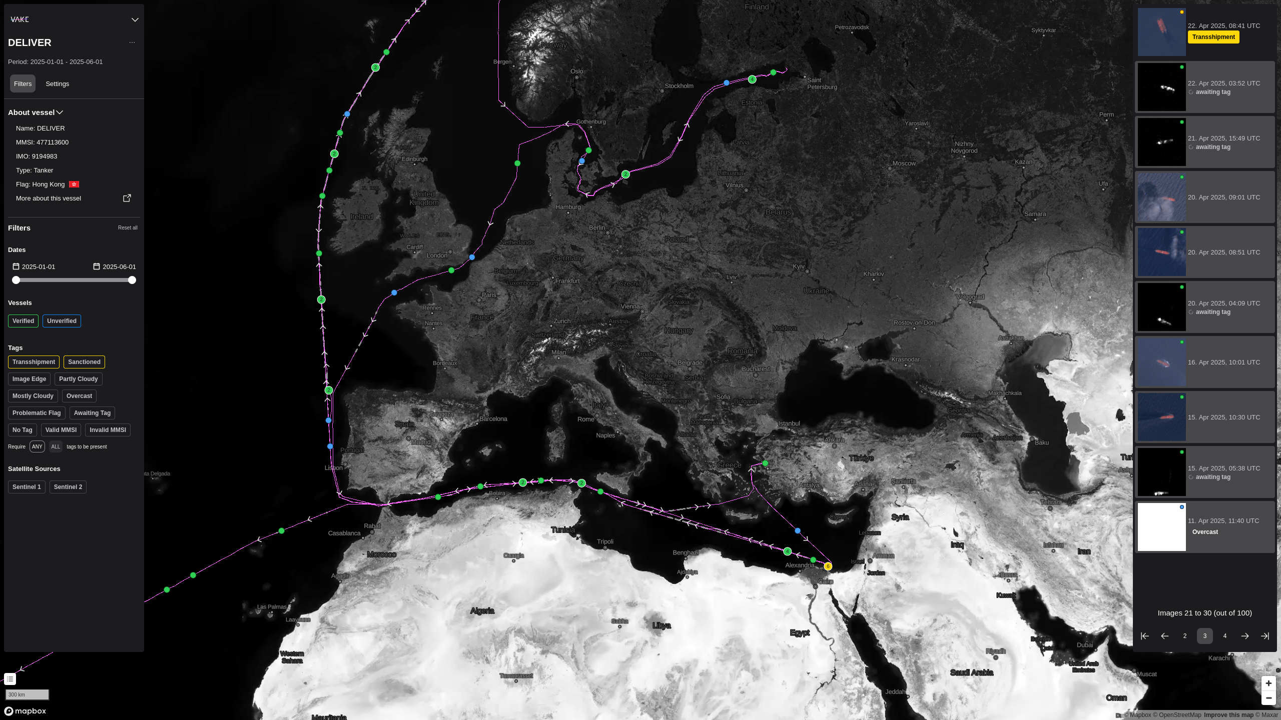
In the center of the subscription is the map, and the visual representation of the vessel track. On the left side you find the filter menu, giving you some vessel details and options for filtering the insights on the screen. On the right side is the dynamic menu. This menu will change based on what you click on, to give you relevant information such as satellite image details.
Filter Menu
The Filter Menu gives context to the subscription. In the top you find information about the vessel displayed, such as name, MMSI, and IMO. Below are the filters, where you can adjust what you see. Currently, we have filters on time period, verfied and unverified vessel positions, meta-tags on the insights themselves, and data sources.
Date Selector
Use this selector to narrow down the track duration, or play with it to better understand the pattern for the vessel. The AIS track that is rendered on the map is a collection of lines (subtracks) separated by gaps in the AIS.
Legend
Located in the bottom-left corner just above the scale indicator, is the map legend. Clicking on the map legend expands it to show the different elements on the page. Check the tooltips marked by a question mark in the legend for more information.
- Green Dots AIS positions that are confirmed by detections from satellite imagery or RF data.
- Blue Dots AIS positions without supporting detections from satellite imagery or RF data.
- Purple Lines Continous AIS track
- Grey Doted Lines Gap in AIS track longer than 30 minutes.
Dynamic Menu
The dynamic menu is located at the right hand side, and displays all events for the vessel of interest. You can see satellite images as well as SAR images. Events are sorted by date.
Hovering the images in the dynamic menu makes the event in interest to be marked in the map. This makes it easy to connect the dynamic menu to the map.
By clicking either on an event in the menu, or by clicking on an event marked in the map, the dynamic menu changes to event-view, and gives you more information about this specific event, and relevant action(s) to this event.
Map
The map is the core visual navigation element in the report.
Navigating the map works in the same way as you are familiar with from other big maps-products
- Move around the map: Left**-**click and drag to navigate in the map..
- Zoom in or out of the map: Press the Plus (+) or Minus (-) keys in the bottom right corner. Tip: Hold command (Mac) / Ctrl (Windows) and use the scrollwheel on your mouse to zoom to the exact level you prefer.
- Tilt (3D mode): Right-click and drag to adjust tilt of the map.
- Dots with numbers: indicates that there are several events connected to the spot. If a number is shown, the number indicates how many images/events are on that spot. Zoom in to see the individual events, or click the cluster to expand it directly.